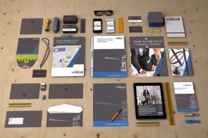
 Kapnick Insurance Group unveiled their brand refresh - including an updated logo, all new marketing materials, positioning statement and new Website - to all of the company’s team members on Friday, March 28th _ A five minute video was shown educating the employees about what a brand is, how they are the Kapnick brand, wrapping up with the unveiling of the new corporate identity and message platform - Strength. Knowledge. Direction. plus a sneak peek of the website. Showcasing their new look, Kapnick invested in a series of Crain’s Detroit Business ads and a digital ad campaign with Valassis Communications.
Mike Kapnick, President & COO, announced the company’s brand refresh with a nod to the past and commitment to keep moving forward. Jim Kapnick, CEO, shared his enthusiasm, “This is a very exciting time for us at Kapnick Insurance Group. We continue to be successful year after year – and as we grow, our brand identity is more important than ever. As we look back on how many strides we have taken in a short year’s time, we remain dedicated to moving Kapnick into the future with a new consistent brand identity and message platform. We have an incredible history and want to thank everyone who has been with us along the way. This new positioning combines our mission of earning client loyalty through exceptional service with a fresh new look that aligns our new corporate initiatives, teams, and directions. When you think of insurance, think of Kapnick Insurance Group. When you see Kapnick think - Strength, Knowledge and Direction.”
Founded in 1946 as a small, storefront personal insurance agency by Elmer Kapnick, the company was simply known as Kapnick Insurance. They updated their name after acquiring Harbor Benefit Services in 2005 to Kapnick Insurance Group. A new logo adopting a lighthouse icon from Harbor Benefit Services was designed. However, as the years past, a disconnect from the lighthouse was evident and their message platform, People helping people…it’s what we do best, also lived alone with no dotted lines to the brand. The website was updated in 2010, but was ready for a makeover. With a high level of industry recognition, the company's internal marketing team was tasked with refreshing the logo, message platform, marketing materials and the website.
The result is a modern representation of Kapnick Insurance Group through their logo - featuring an iconic one color look while retaining the lighthouse image. The lighthouse is also used on a grand scale on all of the collateral pieces showing half of the lighthouse and ray. The new message platform is Strength. Knowledge. Direction. “The goal of this statement is to link the marketing language and ‘voice’ of Kapnick to the lighthouse icon and to our logo. Symbolic of the lighthouse image is longevity of the company, expertise, counsel and guidance Kapnick employees provide their clients,” said Rene’ Carpenter, Corporate Communications Manager.
For the website, Kapnick wanted a completely new site that reflected best practices, including a responsive design that focused strongly on the culture of Kapnick, their employees and client service. The new website was designed graphically to coordinate with the refreshed design of all marketing materials, while carrying through the language and message platform these materials were built around.
About Kapnick Insurance Group - Kapnick Insurance Group is a third generation, family-owned agency headquartered in Adrian, Michigan. They have been a part of the Ann Arbor business community since 2001, and have an additional office in Southfield. Their nearly 150 employees have been providing clients insurance and employee benefits for over 65 years. To learn more, visit their website at www.kapnick.com. Point of Contact: - Rene’ Carpenter | 888.263.4656 x1154 | rene.carpenter@kapnick.com

